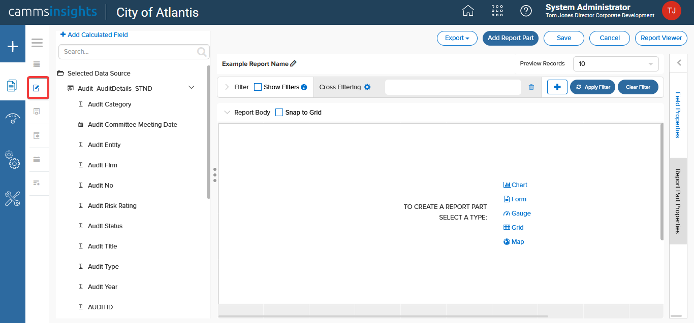
Creating a Report
To create a new report, click the “+” icon from the left menu.

Selecting Datasets
You will be defaulted to the Data Source tab. You can now select the required data sets from the adjacent list of datasets.
Start typing in the Search box to quickly locate a specific dataset.

NOTE: If you select more than one dataset, any relationships defined by CAMMS and/or your Administrator will automatically be created on the bottom right panel. You can also configure your own relationships by clicking the Add Relationship button. When joining a large number of datasets for more complex reports you may find that
- not all required relationships get created automatically
- created relationships may need to be converted to a different “join” type to give you the data you need
If you need any assistance creating these relationships, please contact your Insights Administrator.
TIP: The Distinct checkbox, if ticked, will force the report to return unique values only. It is recommended to always tick this if you are joining more than one dataset.
Next move to the Design tab. It will automatically collapse to maximize screen space.
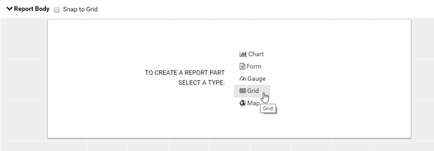
Adding a Report Part
An Insights report is comprised of Report Parts. These report parts are the smallest units of a report which allow you to build reports modularly with ease.
Available types (based on permissions assigned to you by your Administrator) are:
- Grid
- Chart
- Gauge
- Form
Click on a report part type. If a report part does not appear by default, simply left click anywhere inside the Report Body grid and one will appear.
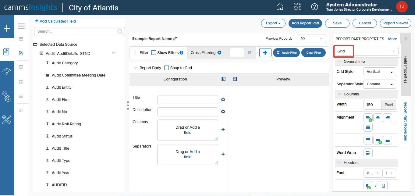
Once you select your report part type, you will see that it has “flipped” to Configuration Mode. Configuration Mode allows you to configure the data sources linked to your report part to create all of your data visuals.
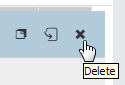
TIP: An added report part can be copied or removed by clicking the respective copy or delete icons in the configuration header.
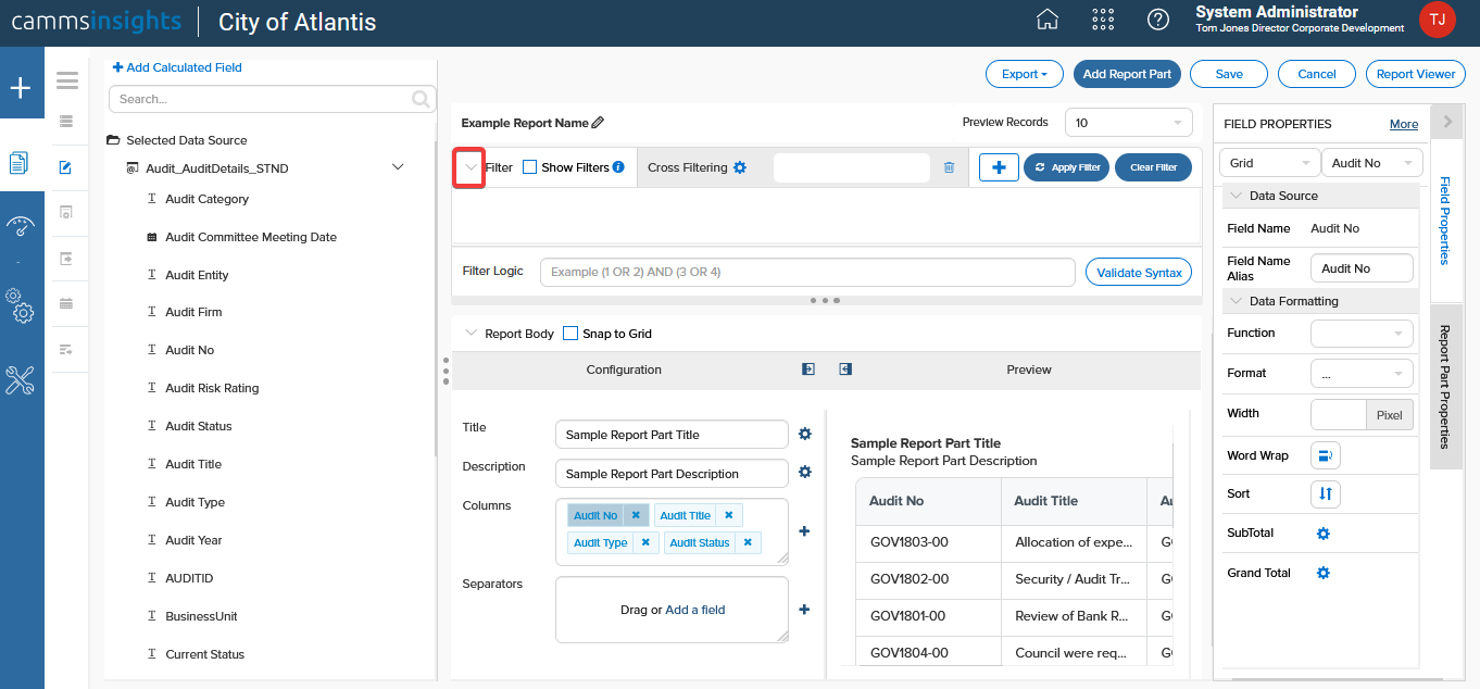
While in Configuration Mode, you will see all the configurable parts of the report part on the left (red box). On the right (green box), you will see a preview of the front (the displayed portion) of the report part.
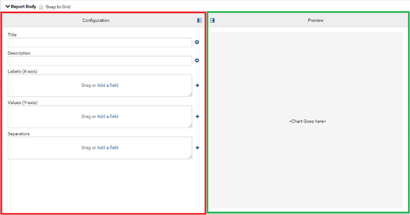
In the below example, you can see that a Grid type part has been added to the report.
Note: Once assigned, you cannot change the type of a report part. You will have to delete the existing report part and create a new one.
If additional parts have been added to your report, they too will be accessible via the dropdown at the top of the panel allowing you to easily switch between report parts.

You can also add a title and a description to your report part by adding text into the respective fields as shown. An automatic preview will appear on the right-side panel.
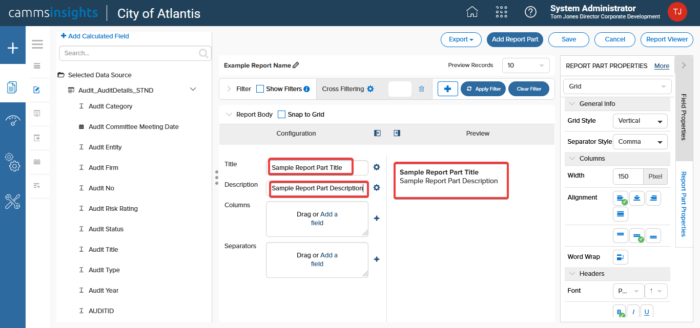
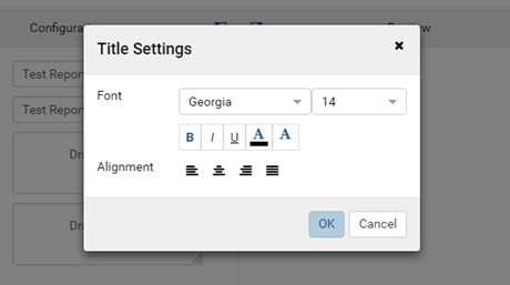
If you want to apply further formatting, click the cogwheel icon placed next to the field.
To access all the properties related to a Report Part, simply click on the Report Part Properties tab on the right and choose your desired report part by using the dropdown at the top. You can also toggle between basic (less options) and advanced (more options) mode by using the Less/More links at the top.

For example, in relation to a chart you may use this panel to configure the chart type, legends and/or hover labels.
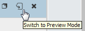
TIP: Report parts can be resized, dragged to a new location, or switched position with each other only in Preview Mode.
Adding Data Fields
There are two ways to add data fields into a report part.
Method 1: Click on a field name from the left panel and drag-drop it on to the needed area as shown.
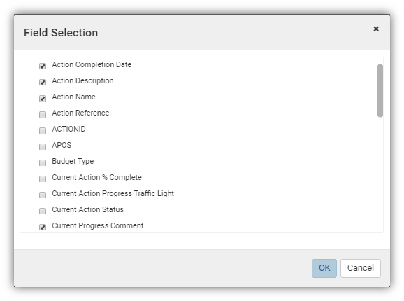
Method 2: Click the “+” icon next to the required area and select from the list of fields shown in the popup and click Ok.
Fields can easily be moved from one area to another and even rearranged. In relation to a Grid type report part for example, once you have a field in the Columns area, try dragging it to the Separator area. If you wish to delete a field, simply press the “x” button next to it.

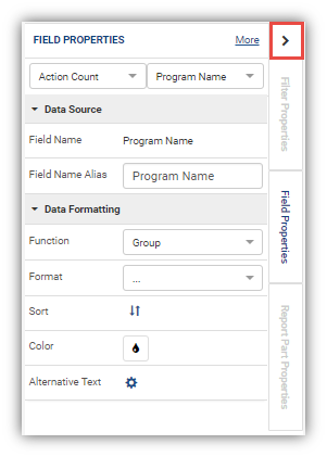
If you wish to access all the properties related to a Data Field, you can
- Click on the field name to activate the Field Properties tab on the right or
- Click on the Field Properties tab on the right and use the dropdown to select your desired field.
Within the Field Properties panel you can also toggle between basic (less options) and advanced (more options) mode by using the Less/More links at the top.

For example, you may use this panel to set a data format, determine sort order and/or apply conditional formatting.
Setting an Alias
If you wish to change the name of a data field you can use the Field Name Alias to enter the desired name as shown.

Conditional formatting
If you wish to color a cell, column or line based on a condition, click the Cell Color or Text Color icon as shown.

In the pop-up that appears, click Add Setting.

Now you can add as many conditions as you wish and apply the relevant color. In the below example, we are coloring all cells with the value “Completed” in green.

This will now appear in your report as follows.

Adding Filters
Similar to data fields you can either drag and drop a filter directly into your report’s filter panel.
This adds a blank filter to your report. Use the dropdowns to choose the filter operators and settings along with the data field you wish to filter by.
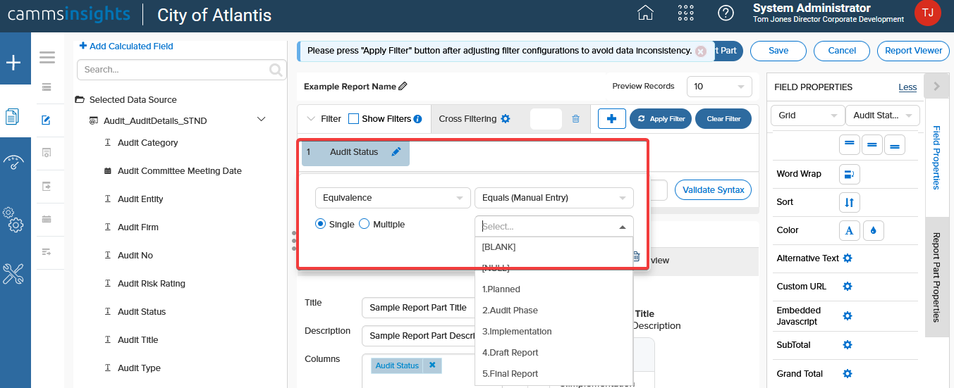
Click the Apply Filter button as shown. You can remove any filter by simply clicking on Clear Filter button upon selecting the filters that should be removed.

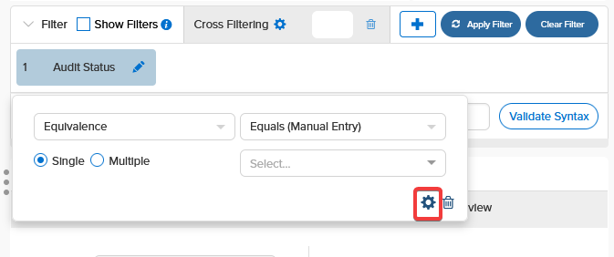
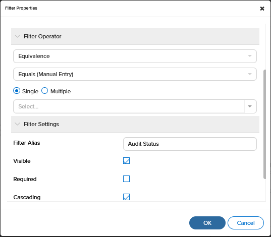
If you wish to access all the properties related to a Filter, you can
- Click on the Cog wheel icon to access Filter Properties to select your desired filter settings.
For example, you may choose to determine filter equivalence options, toggle visibility and/or set an alias.
Maximising screen space
When you are designing a report, you may want to utilise some of the tips outlined below to maximise the available screen area.
- Collapse the Filter panel so you have better access to the Report Body section.
- Once you have finished adding most of your data fields, separators and filters you can click and drag the left edge of the Data Source panel to maximise screen space.

- When not using the right side Field/Filter/Report part panels, you can collapse it to the right using the arrow shown below.
Formatting the Header, Footer, Title
The Report Designer/Format page allows the user to
- Layout and format report header and footer
- Enter a report title and description
Add and Configure Items in Report Header and Footer Layout
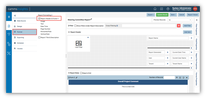
In Report Designer, click Format in the left menu.
Tick Report Header & Footer check-box in Middle Panel to display Report Header and Report Footer sections with the default layout.
Click the Add Item button to add new items to the layout. An Add Item pop-up will be displayed - select an item type from the drop-down box and click OK to close it.

NOTE: You can also click and drag an item type from the Middle Panel to the report header area to add a new item.
1. Click on the newly-added item to enable the Format Properties box.
2. Configure the properties in General Info group.
For an Image:
- Give the image a unique name.
- Enter the image url.
For a Text item:
- Give the item a unique name.
- Enter a value to display.
For a Date Time, Page Number, Horizontal Rule or Vertical Rule item:
- Give the item a unique name.
- The value is read-only and has already been fixed as {currentDateTime}, {pageNumber}, {horizontalRule} or {verticalRule}.
NOTE: System Variables and expressions can be used as values of these items.
3. Configure the properties in Item Formatting group.
For Date Time and Page Number:
- Choose a display format
For Text, Date Time and Page Number:
- Choose a font face and font size.
- Choose text effects bold, italic and underlined.
- Set text color and cell color.
- Choose text alignment left, center, right or justify.
For Horizontal Rule and Vertical Rule:
- Select a line pattern: Solid (default), Dot or Dash.
- Select a line color.
- Select the line thickness (in pixels).
4. Click Save at the top.
Layout Items in Report Header and Footer Layout
Items in the Report Header and Footer can be:
- Resized vertically, horizontally or diagonally.
- Dragged around.
- Deleted.
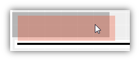
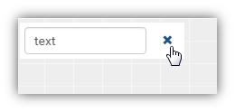
Click and drag an item as shown below
To delete, use the x icon as shown below.
NOTE: Headers will not repeat on subsequent pages if your Exporting Orientation is set to landscape or your page size is smaller than A4/Letter.
Enter the Report Title and Description
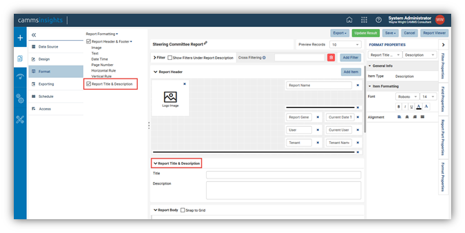
1. In Report Designer, click Format in the left menu.
2. Tick Report Title & Description check-box in Middle Panel to display Title and Description text boxes.
3. Enter the title and description.
4. Configure the properties in Item Formatting group.
- Choose a font face and font size.
- Choose text effects bold, italic and underlined.
- Set text color and cell color.
- Choose text alignment left, center, right or justify.
5. Click Save at the top.