Similar to grids, you will be able to configure your chart using the red highlighted configuration panel on the left and see a preview on the green highlighted preview panel on the right. Chart is a built-in type of report part that displays data using graphical symbols, such as bars in a bar chart, lines in a line chart, or slices in a pie chart.

By default, Charts are created as line graphs with an X-Axis and Y-Axis. To change graph types, direct your focus to the Report Part Properties panel on the right, ensure the General Info menu is open, and select your chart type in the dropdown as shown.
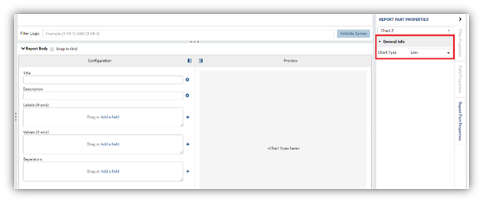
Note: Once you have assigned a chart type, you can always change it. Fields already present will auto configure to your chart change but further tweaking will most likely be necessary to create your desired chart.
The Report Part properties available for Charts are listed in 7 sections.
- General Info
- Chart
- Labels
- Legends
- Grouping
- Data
- View
Common Chart Properties
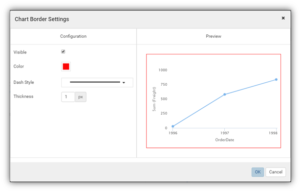
Setting a border
In the Chart group, click the gear icon (⚙) to open Border Settings pop-up.
- Choose the border to be visible or not.
- Select a border color.
- Select the border thickness (in pixels).
- Click OK to close the Border Settings pop-up.
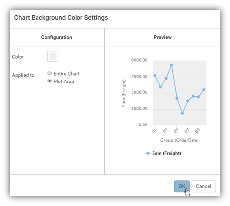
Set the background color
In the Chart group, click the gear icon (⚙) to open Chart Background Color Settings pop-up.
- Select a background color.
- Choose to apply the colour to the entire chart (the area inside the border above) or to the plot area only (on the right).
- Click OK to close the Chart Background Colour Settings pop-up.
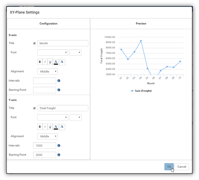
Configure X-axis and Y-axis
NOTE: Applicable to the chart types Line, Column, Bar, Area, and Combination only.
- Customize the title (“Month” instead of “Group (OrderDate)” and “Total Freight” instead of “Sum(Freight)”).
- Set the title font face and font size.
- Choose title text effects bold, italic and underlined.
- Choose title text color and background color.
- Choose title text alignment e.g. Middle.
- Customize the relative distance between the tick marks. In the sample screenshot, “10000” is entered into the Intervals box of Y-axis, so there will be exactly one tick mark after every 1000 units on Y-axis (4000.00, 5000.00, 6000.00, 7000.00, etc).
- Customize the starting value for the chart. In the sample screenshot, “3000” is entered into the Starting Point box of Y-axis, so only the points having Sum(Freight) value greater than or equal to 3000 are displayed.
Configure grid lines
- Choose the grid lines to be visible or not.
- Select a line colour.
- Select a line pattern: Solid (default), Dot or Dash.
- Select the line thickness (in pixels).

Configure color theme
- In Chart group, click the gear icon (⚙) next to the Color Theme option to open Color Theme Selection pop-up.
- Select a color theme and click OK to the pop-up.

Configure multiple colors
- In Chart group, select Multi-Color checkbox.
- Then the chart will receive one color per point.
NOTE:
- Multi-Colour option is only available for single metric charts. When using multiple metrics each metric is a different color.
- Sparkline chart type does not support Multi-Colour option.
Configure label text direction
In Labels group, set the text direction for each of your labels.

Configure the legends
In Legends group, choose options related to your chart’s legend.

Choose to display values of data points

Chart styles
You can utilise different chart styles such as Line, Column, Pie, Heatmap, etc. Report Part Properties may differ based on the chart style selected.
- Line Chart – Used to display data as a series of data points ordered by value and connected by lines. Therefore, the line chart can be used to visualize a trend in data over intervals of time.
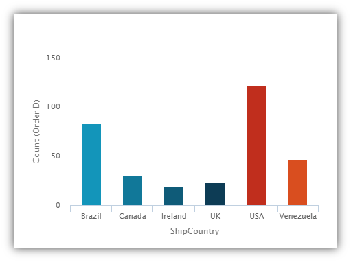
- Bar Chart and Column Chart - A bar chart displays groups of data as rectangular bars with lengths proportional to the values that they represent. Therefore, the bar chart can be used to show comparisons among different groups. Column chart is similar but the rectangular bars are vertical instead of horizontal.
- Area Chart - Displays graphically quantitative data and is based on the Line Chart. The area between axis and line are commonly emphasized with colors, textures and hatching. Commonly one compares two or more quantities with an area chart.
- Pie Chart and Donut Chart - Displays data in a circle, divided into slices to illustrate numerical proportion. For example, these can compare the number of Actions distributed among different Business Units.
- Funnel Chart - Displays values as progressively decreasing proportions. Ideally, the funnel chart shows a process that starts at 100% and ends with a lower percentage where it is noticeable in what stages the fall out happens and at what rate - the funnel chart illustrates where the biggest bottlenecks are in the process.
- Combination Chart - Allows combining multiple charts of different types together in the same report part. For example, you would use this to create a bar and line chart.
- Tree Map Chart - Displays data as a set of rectangles. It is good for comparing proportions and spotting patterns. It can also display a large amount of items on the screen simultaneously.
- Heat Map Chart - Displays values in a matrix, with larger values represented by darker colors.
- Scatter Chart - Displays data as data points, at the intersection of an x and a y numerical value. For a scatter chart, both horizontal and vertical axis are value axis, there is no category axis like the line chart.
- Bubble Chart - A variation of scatter chart in which the data points are replaced with bubbles, and the size of the bubbles represents an additional dimension of the data.
- Waterfall Chart - Shows a running total as values are added or subtracted. It is useful for understanding how an initial value is affected by a series of positive and negative values.
- Sparkline Chart - A tiny chart, usually drawn without axis and labels. It provides a visual representation of data in a simple and compact way. It is most commonly used as an embedded report.