- This component will display all the actions linked to a particular hierarchy node. The dashboard view of the Action Node component will be as follows:


Notes:
- All details above will retrieve from Camms.Strategy.
- The display order of the Action nodes will be similar to the order of the Action list shown in the admin panel.
Configuring the Action Node component
- Like the other components, you can drag and drop components into the page design section and configure as per the requirement.

- Title - You can add a title to the component.
- Description - You can add a description to the Action Node component which will be displayed above the Action Nodes on the dashboard.
- Layout – You can select the view mode of the Action nodes to be displayed on the dashboard, either ‘carousel’ or the ‘tile’ view.
- Number of Visible Nodes for Carousel View – You can select the number of nodes to be displayed in the dashboard and the maximum number of nodes that can be configured is 6 whereas the minimum is 1.
- Number of Characters to Display on the Title – You can define the number of characters to be displayed for the action name.

1. Search Bar - You can search for an Action by entering text on the search bar placed above the grid of actions.
- You can click on the ‘Enable All’ option to make all the actions visible at once, and ‘Disable All’ to make all the actions disabled at once. This feature is implemented for all grid and node components. (Action, KPI, Risk, Project, Risk Control, Scorecard)
Notes:
- These two options will be available for all the List and Node components.
- You have to scroll to your right in the Action configuration grid to edit the data. (Use arrow keys or the scroll bar placed at the bottom of the grid section. The records in the grid are enabled for inline editing. Click on the edit button placed at the right corner to edit a row.
2. Action Name- This refers to the Action name added in Camms.Strategy. You can edit the name on the Action Node configuration grid.

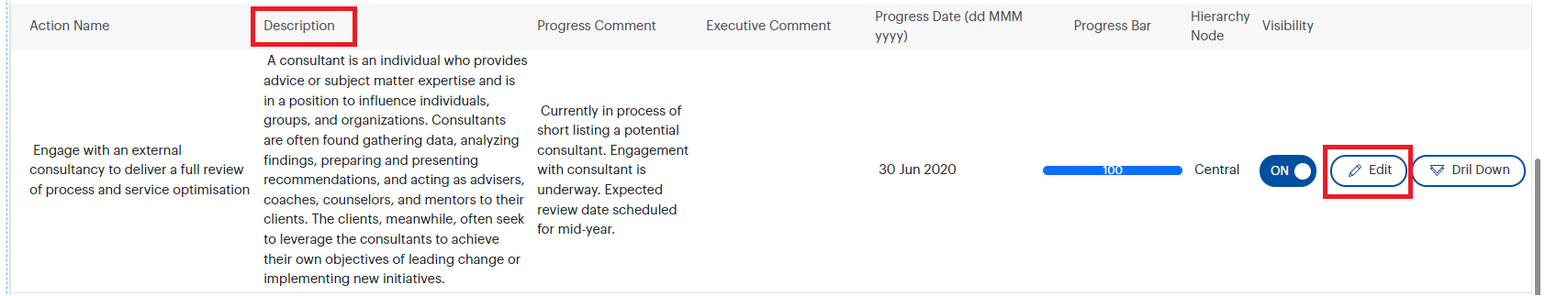
3. Description- refer to the description of the Action added in Camms.Strategy. This can also be editable on the grid but will be visible in the Action detail view of your dashboard.
4. Progress Comment – refers to progress of the action added in Camms.Strategy. This will be displayed in your action detail view.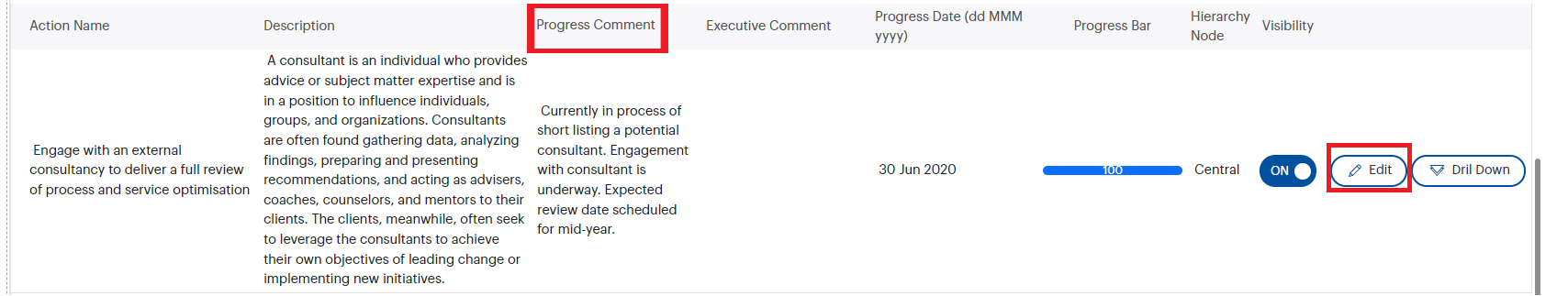
5. Executive Comment – The executive comments are taken from the executive report selected at the dashboard creation phase and will display the comments added against the selected Action on the executive report selected.
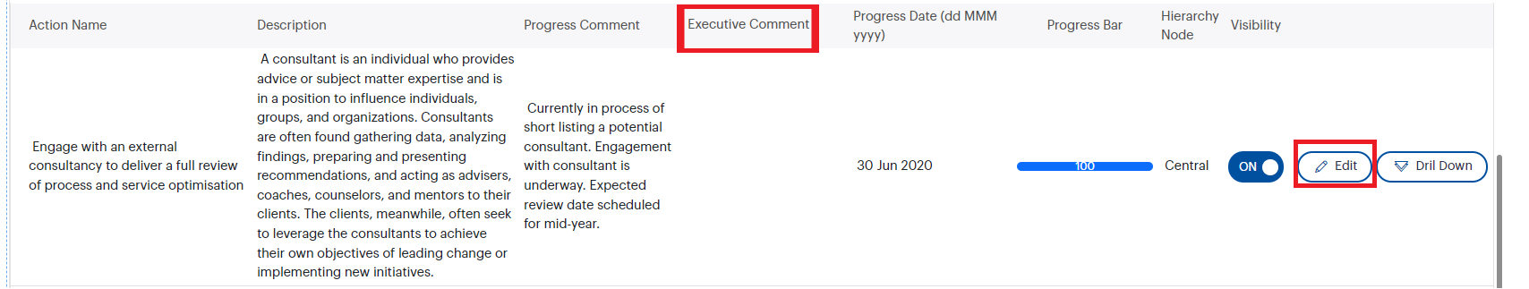
Note: Executive comment will be displayed for the public users while the progress comment is visible only for the logged in users. Both will be displayed in the Action detail view.
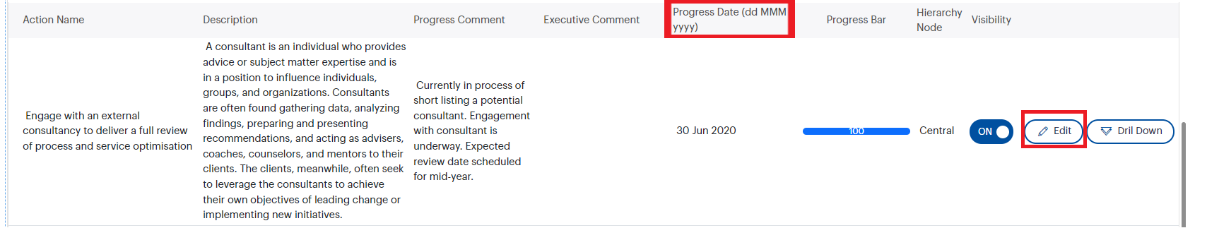
6. Progress Date- You can setup custom performance date (besides the global performance period setup at the dashboard creation phase) for each Action. If the period ends it should refer to the New Year and set 0 as progress complete. If it's within the running period, it should be the completed percentage at that moment.
7. Visibility- You have to enable the visibility toggle button to show the Action on the dashboard. The toggle button is disabled by default.

8. Progress Bar – this will display you the progress of the Action on a performance bar.

9. Hierarchy Node - This refers to the name of hierarchy node which the relevant action is linked to.

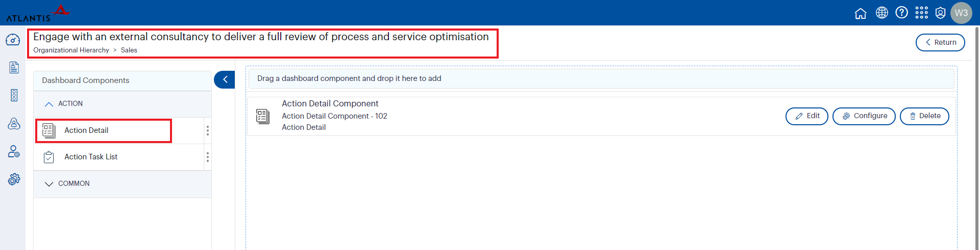
- You can configure the fields to be shown in the ‘Action Detail View’ of your dashboard by clicking on the configure icon of the ‘Action Detail’ component.
- Apply to – This dropdown will allow you to apply the configurations dashboard wise, component wise or page wise at once. Default value will be ‘Apply to dashboard’. You have the ability to select the required option from the dropdown. This dropdown will be available underneath every configuration grid.
- Field Name - refers to the field name in Camms.Strategy.
- Label Name – refers to the field name to be displayed on the dashboard, you can edit this as per your choice.
- Visibility – enable the visibility toggle button to make the fields visible on the dashboard. The toggle buttons will be disabled by default. All the fields will be checked by enabling the toggle button next to ‘Visibility’ label in the header of the configuration grid
- Apply to – This dropdown will allow you to apply the configurations dashboard wise, component wise or page wise at once. Default value will be ‘Apply to dashboard’. You have the ability to select the required option from the dropdown. This dropdown will be available underneath every configuration grid.
Note: You can click ‘Save’ button once the changes have been done.

Note: Only the action detail component will be shown in the Individual Action configuration. You can drag and drop the component to the design area and can configure each action.