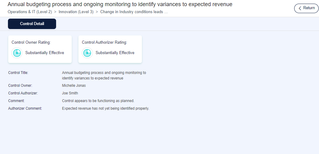
- This component will display the details of a control. The dashboard view of the Control Detail will be as follows:
Configuration of Control Detail component
- Once you drag and drop the component to the page design area, you can click on the ‘Edit’ icon to edit the details of the Control Detail Component.

- Title - You can add a title to the component, which will be displayed above the component.
- Description – A description for the component can be added which will be displayed above the component
Note: Click on the ‘Save’ button to save the changes.
- You can configure the fields to be shown on the ‘Control Detail’ on your dashboard by clicking on the configure icon of the ‘Control Detail’ component.
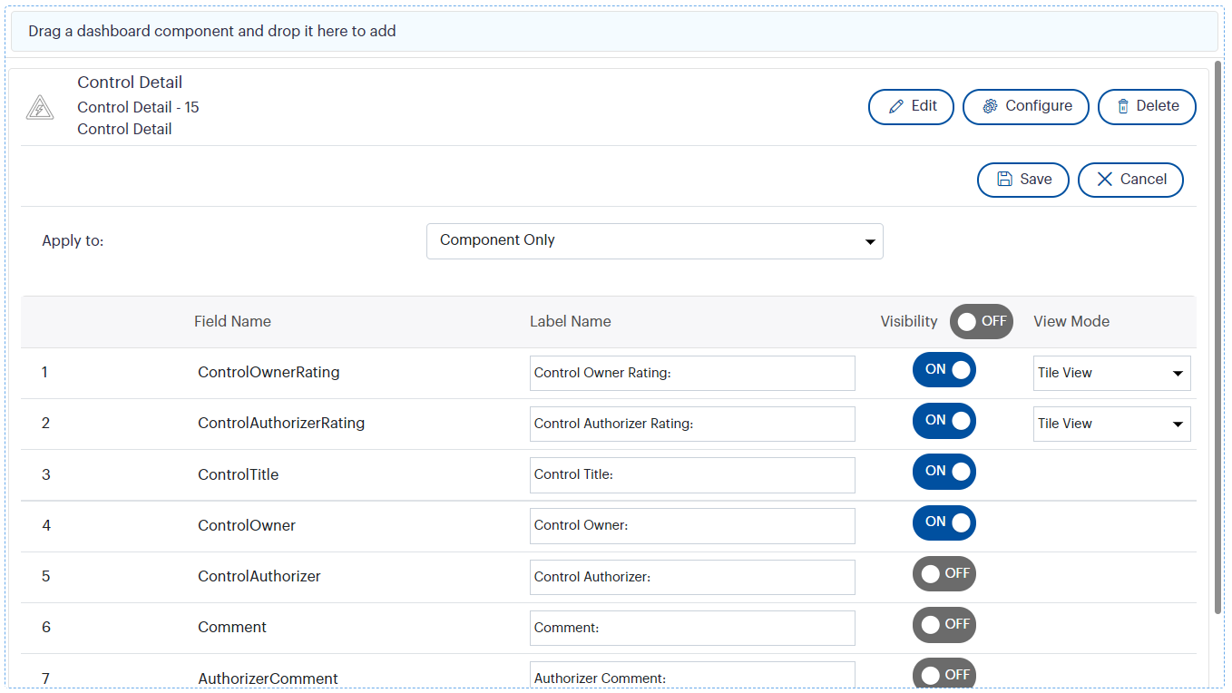
- Apply to – This dropdown will allow you to apply the configurations dashboard wise, component wise or page wise at once. Default value will be ‘Apply to dashboard’. You have the ability to select the required option from the dropdown. This dropdown will be available underneath every configuration grid.
- Field Name - refers to the field name in Camms.Strategy.
- Label Name – refers to the field name to be displayed on the dashboard, you can edit this as per your choice.
- Visibility – enable the visibility toggle button to make the fields visible on the dashboard. The toggle buttons will be disabled by default.
- View Mode - you can view the Control Owner Rating and-Control Authorizer Rating columns either in tile or grid view mode.
Note: If those fields are in the tile view mode, those would appear at the top of the component according to the sequence order that has been set from field configuration menu.
But, if those fields are in the grid mode, those would appear below the tiles, and would also get the sequence order from field configuration menu accordingly.
Note: You can click ‘Save’ button to save the changes.