- This component will display the details of a project. The dashboard view of the Project Detail component will be as follows:

Note: All the fields above will retrieve from Camms.Project.
Configuration of Project Detail Component
- Drag and drop the Project Detail component into the page design section and click on the edit button to configure the component.
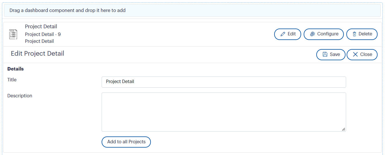
- Title – You can add a title to the Project Detail component.
- Description – You can add a description to the component, which will be displayed above the Project Detail view on the dashboard.
Note: Click on the ‘Save’ button to update the changes.
- Add to all Projects - This feature will allow you to apply this detail component to the respective list/node component at once, rather than manually adding the detail component to each list/node component one by one. When you click it, you will be given two options (see below figure)

- Apply settings for newly added Projects only
- Selecting this option will add the Project detail component with the settings, for all the Projects which doesn’t contain the Project detail component.
2. Apply settings for newly added and existing Projects
- Selecting this option will add the Project detail component with the settings for all the projects. The projects which already contain the Project Detail component previously added will also get updated with the new settings.

- All the fields from the Project Detail object of Camms.Project will be available in the Configuration Menu of the Project Detail component.
- Apply to – This dropdown will allow you to apply the configurations dashboard wise, component wise or page wise at once. Default value will be ‘Apply to dashboard’. You have the ability to select the required option from the dropdown. This dropdown will be available underneath every configuration grid.
- Field Name – refers to the Camms.Project field name.
- Label Name – you can edit the label name, which refers to the name to be displayed as the label on the dashboard.
- Visibility - Enable the visibility toggle button to make the labels visible on the dashboard. The toggle button will be disabled by default
- View Mode - you can view the Assessment score, Issue Traffic Light, Budget Status, Percentage Complete, Project Progress, Risk Traffic Light and Scope Traffic Light columns either in tile or grid view mode.
Note: If those fields are in the tile view mode, those would appear at the top of the component according to the sequence order that has been set from field configuration menu.
But, if those fields are in the grid mode, those would appear below the tiles, and would also get the sequence order from field configuration menu accordingly.
Note: Click on the ‘Save’ button to save the changes.